A blog needs two pages: a list with tag filters and pagination, and a post with its body, a table of contents and reactions. With @kookee/react both are a data fetch and a handful of components. The examples use the Next.js App Router, with the SDK client and its config from lib/kookee.ts as set up in Using the React components with Next.js, TanStack Start or Vite; the components are the same in any framework.
The list page
// app/blog/page.tsx
import { BlogPostList, BlogTagFilter } from '@kookee/react/blog';
import { Pagination } from '@kookee/react/entry';
import { kookee } from '@/lib/kookee';

type Search = { tag?: string; page?: string; q?: string };

function blogHref({ tag, q }: Search, page: number) {
  const params = new URLSearchParams();
  if (tag) params.set('tag', tag);
  if (q) params.set('q', q);
  if (page > 1) params.set('page', String(page));
  const query = params.toString();
  return query ? `/blog?${query}` : '/blog';
}

export default async function BlogPage({ searchParams }: { searchParams: Promise<Search> }) {
  const search = await searchParams;
  const page = Number(search.page) || 1;

  const [posts, tags] = await Promise.all([
    kookee.blog.list({ page, limit: 12, tags: search.tag ? [search.tag] : undefined, search: search.q }),
    kookee.blog.getTags(),
  ]);

  return (
    <>
      <form action="/blog" method="get" role="search">
        <input type="search" name="q" defaultValue={search.q} aria-label="Search posts" />
        {search.tag && <input type="hidden" name="tag" value={search.tag} />}
      </form>

      <BlogTagFilter tags={tags} activeTagSlug={search.tag} href="/blog?tag={tagSlug}" allHref="/blog" showCounts />

      <BlogPostList
        posts={posts.data}
        href="/blog/{slug}"
        tagHref="/blog?tag={tagSlug}"
        empty={
          <p>
            No posts match. <a href="/blog">Clear filters</a>
          </p>
        }
      />

      <Pagination page={page} totalPages={posts.totalPages} href={(n) => blogHref(search, n)} />
    </>
  );
}
What each piece does:
BlogPostListrenders a card per post: cover image, title, excerpt, author, date and tags. The first card's cover loads eagerly with a high fetch priority, because it is usually the largest thing on screen; the rest load lazily.emptyreplaces the default "No posts yet." when nothing matches.BlogTagFilterlists your tags as links. The one matchingactiveTagSluggetsaria-currentanddata-active="true", andshowCountsadds each tag's post count.allHrefis the "All posts" link.Paginationshows the first page, the last, and one either side of the current page, with an ellipsis for each gap; a gap of a single page shows that page instead. At the ends, Previous and Next become disabled text instead of links. It renders nothing when there is only one page.The search form is plain HTML. A GET form submits to
/blog?q=…and the page renders again, in every framework, so the package ships no component for it. The hidden field keeps the active tag.
All of these are links rather than client-side state, so the page works before any JavaScript loads and every filtered view has its own address. For search engines, give each unfiltered page after the first its own canonical URL (/blog?page=2), rather than pointing them all at /blog, or the posts that only appear on later pages are harder for a crawler to reach.
A long tag list
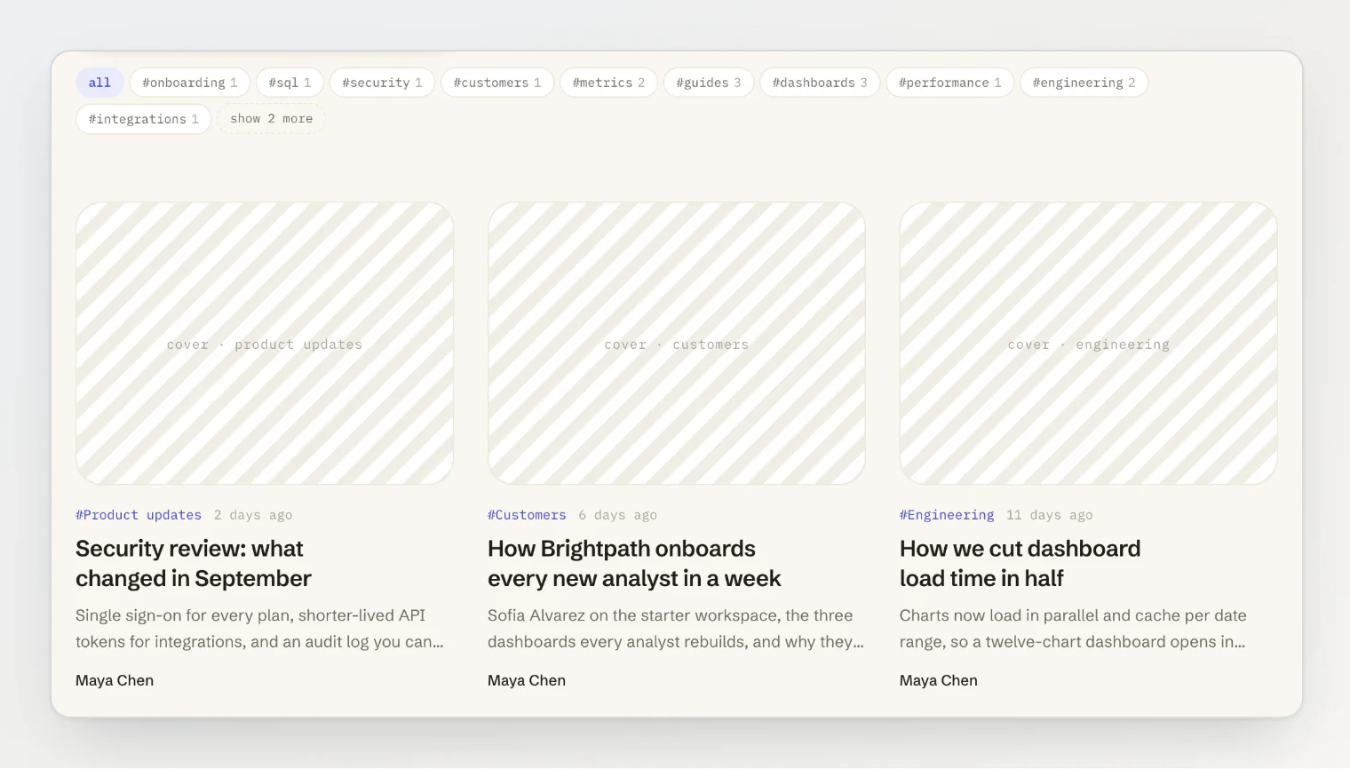
With many tags, limit shows only the first ones (from version 1.9.3). The tags past it still render, with the hidden attribute and data-overflow="true", so a crawler still finds every tag link, and the active tag is never hidden. toggle renders a last item whenever limit hides tags, and expanded shows them all. In a client component, hold expanded in state:
// app/blog/tag-filter.tsx
'use client';
import { useState } from 'react';
import type { EntryTagWithCount } from '@kookee/sdk';
import { BlogTagFilter } from '@kookee/react/blog';

export function TagFilter({ tags, activeTagSlug }: { tags: EntryTagWithCount[]; activeTagSlug?: string }) {
  const [expanded, setExpanded] = useState(false);
  return (
    <BlogTagFilter
      tags={tags}
      activeTagSlug={activeTagSlug}
      href="/blog?tag={tagSlug}"
      allHref="/blog"
      showCounts
      limit={10}
      expanded={expanded}
      toggle={(hiddenCount) => (
        <button type="button" aria-expanded={expanded} onClick={() => setExpanded(!expanded)}>
          {expanded ? 'Show less' : `Show ${hiddenCount} more`}
        </button>
      )}
    />
  );
}
The root gets data-expanded, and toggle receives the number of tags limit hides. On a site without client components, drive expanded from a URL parameter and render a link as the toggle. A classNames.item that sets display overrides hidden and shows every tag; Tailwind's Preflight keeps [hidden] hidden.
While the list loads
BlogPostListSkeleton renders the list's own layout with pulsing placeholders, so the page does not jump when the posts arrive. Use it in a loading.tsx, a Suspense fallback, or next to a hook's isLoading:
// app/blog/loading.tsx
import { BlogPostListSkeleton } from '@kookee/react/blog';

export default function Loading() {
  return <BlogPostListSkeleton count={6} />;
}
The post page
// app/blog/[slug]/page.tsx
import { notFound } from 'next/navigation';
import { KookeeApiError } from '@kookee/sdk';
import { BlogPost } from '@kookee/react/blog';
import { extractHeadings } from '@kookee/react/entry';
import { Reactions, TrackedTableOfContents } from '@kookee/react/entry/client';
import { kookee, kookeeConfig } from '@/lib/kookee';

async function getPost(slug: string) {
  try {
    return await kookee.blog.getBySlug(slug);
  } catch (error) {
    if (error instanceof KookeeApiError && error.status === 404) return null;
    throw error;
  }
}

export default async function PostPage({ params }: { params: Promise<{ slug: string }> }) {
  const post = await getPost((await params).slug);
  if (!post) notFound();

  return (
    <div className="post-layout">
      <BlogPost post={post} tagHref="/blog?tag={tagSlug}" classNames={{ content: 'prose' }} />

      <aside>
        <TrackedTableOfContents
          headings={extractHeadings(post.contentHtml)}
          offset={64}
          resetKey={post.id}
          className="sticky top-20"
        />
      </aside>

      <Reactions entryId={post.id} reactions={post.reactions} config={kookeeConfig} />
    </div>
  );
}
BlogPost renders the header (tags, title, author, date and cover) followed by the body. For a different header, compose it yourself from BlogPostHeader or the smaller parts (BlogPostTitle, BlogPostDate, BlogPostAuthor, BlogPostTags, BlogPostCover) and render the body with EntryContent from @kookee/react/entry.
The table of contents
extractHeadings(post.contentHtml) returns the body's headings that carry an id, levels 1 to 3 by default; Kookee gives every heading an id when an entry is saved. Run it on the server and pass only the result, so the page does not ship the body a second time.
TableOfContents from @kookee/react/entry renders the headings as nested links. TrackedTableOfContents from @kookee/react/entry/client also marks the heading being read with aria-current="location" and data-active="true". Both render nothing below two headings (minHeadings), and the list has an "On this page" title that you can rename or hide through labels.tocTitle.
offsetis the height of your sticky header, in pixels. Give your headings ascroll-margin-topno larger than it, so a click on a link lands the heading below the header and it counts as the one being read.resetKeytakes the entry id. On a client-side navigation from one post to another, it makes the table measure the new page.Neither table is sticky on its own. Add the class that makes it sticky in your layout.
Reactions
Reactions renders five reaction buttons, fire, heart, rocket, eyes and mind blown, each with its emoji and, once someone has used it, its count.
The server's HTML shows the counts. The buttons this visitor pressed before light up after hydration, read from
localStorage.A click changes the count at once, then adopts the counts the server returns, and rolls back if the request fails. One request per entry runs at a time; meanwhile the buttons are
aria-disabled.Every
Reactionsfor the same entry on the page stays in step.optionsreplaces the buttons with your own{ type, label, icon }list. A customtypemust match[a-z0-9_]{1,50}, or the API rejects it and the component getsdata-error="true".storageKey(defaultkookee:reactions) is where the visitor's reactions are remembered. Give each reaction widget on your site its own.onReactruns after each successful request, for example to refresh cached data. It is a function, so use it from a'use client'file of your own.
Reactions are anonymous by design: a determined visitor can inflate them, within the API's per-IP rate limit. Treat them as a signal, not a vote count.
Images and covers
Covers load lazily, except the first card of a list and the cover of a post page, which load eagerly. priority on a card, a header or a cover part changes that. To serve covers through next/image or an image CDN, pass renderImage; the framework article shows the Next.js version.
A post without a cover renders no cover box, so in a grid its card is shorter than the others. To keep every card the same shape, pass coverPlaceholder to BlogPostList or BlogPostCard, or placeholder to BlogPostCover (from version 1.9.3). The box renders with what you pass inside it, marked data-placeholder="true" and hidden from assistive technology; true gives an empty box. Style it through the coverPlaceholder slot:
<BlogPostList posts={posts.data} href="/blog/{slug}" coverPlaceholder itemClassNames={{ coverPlaceholder: 'bg-stripes' }} />Customizing
The cards, filter and pagination take className, a classNames map for their inner elements, and itemClassNames for every card of a list. BlogPost takes headerClassNames for the inner elements of its header, such as the title. renderItem replaces the card with your own, built from the exported parts. Style and customize the React components covers all of it, including dark mode and translated labels.