Your feedback board's columns already are a roadmap: Planned, In progress, Shipped, or whatever your team named them. Roadmap from @kookee/react/roadmap renders them as a read-only board on your own site. Voting and commenting stay on your hosted portal, where visitors sign in, so every card links there.
A roadmap page
// app/roadmap/page.tsx
import { Roadmap } from '@kookee/react/roadmap';
import { kookee } from '@/lib/kookee';

export default async function RoadmapPage() {
  const [columns, posts] = await Promise.all([
    kookee.feedback.getColumns(),
    kookee.feedback.list({ sort: 'top', limit: 100, columnType: 'open' }),
  ]);

  return (
    <Roadmap
      columns={columns}
      posts={posts.data}
      href="https://your-project-slug.kookee.dev/roadmap?post={id}"
    />
  );
}
Columns appear in the order you gave them on the board. Columns you hid from the public are left out, and so are posts that sit in them.
columnType: 'open'fetches only the posts in columns your board marks as open. The closed columns, such as a declined or done column depending on how you set it up, still appear, empty. To leave them out, passcolumns={columns.filter((column) => column.type === 'open')}; to show their posts, dropcolumnType.sort: 'top'puts the most-voted post at the top of each column, which is what a visitor usually wants to see first.Roadmapkeeps the order the posts arrive in.Each column has a heading with a dot in the column's colour, its name and its post count, then its cards, or "Nothing here yet." when it is empty.
Each card shows the post's title, the start of its text, a category badge (feature, improvement, bug or other), its vote count, and its comment count when it has comments.
The href above opens the post on your hosted portal's roadmap, where visitors can vote and comment. Replace your-project-slug with your project's slug, or point cards at a page of your own.
Boards with more than 100 posts
One request returns at most 100 posts, so a busy board loses the tail of its longest column. Fetch each column on its own instead, and tell Roadmap the real totals so the column counts stay right:
const columns = (await kookee.feedback.getColumns()).filter((column) => column.isVisible);

const pages = await Promise.all(
  columns.map(async (column) => ({
    column,
    page: await kookee.feedback.list({ columnId: column.id, sort: 'top', limit: 20 }),
  })),
);

<Roadmap
  columns={columns}
  posts={pages.flatMap(({ page }) => page.data)}
  columnTotals={Object.fromEntries(pages.map(({ column, page }) => [column.id, page.total]))}
  href="https://your-project-slug.kookee.dev/roadmap?post={id}"
/>;
Filter by category and search
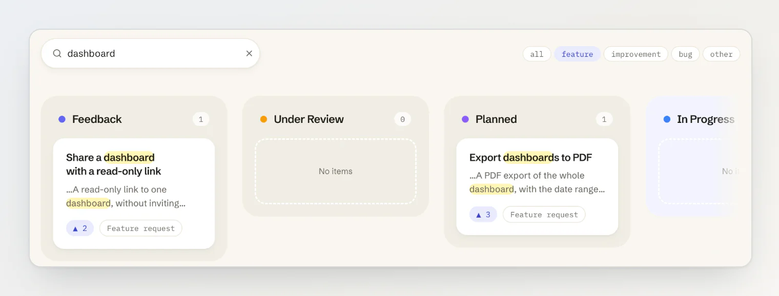
RoadmapCategoryFilter (from version 1.9.3) is a row of links, one per category plus "All", like the changelog's type filter. highlight on Roadmap shows a search: the default cards mark the query's matches in the title and the text, and cut the text to start a few whole words before its first match, so the match shows on the card's first line. Matching ignores case, and a query shorter than two characters leaves the cards as they are.
// app/roadmap/page.tsx
import type { FeedbackPostCategory } from '@kookee/sdk';
import { Roadmap, RoadmapCategoryFilter } from '@kookee/react/roadmap';
import { kookee } from '@/lib/kookee';

const CATEGORIES: FeedbackPostCategory[] = ['feature', 'improvement', 'bug', 'other'];

function roadmapHref(q: string, category?: FeedbackPostCategory) {
  const params = new URLSearchParams();
  if (q) params.set('q', q);
  if (category) params.set('category', category);
  const query = params.toString();
  return query ? `/roadmap?${query}` : '/roadmap';
}

export default async function RoadmapPage({ searchParams }: { searchParams: Promise<{ category?: string; q?: string }> }) {
  const { category, q = '' } = await searchParams;
  const activeCategory = CATEGORIES.find((c) => c === category);

  const [columns, posts] = await Promise.all([
    kookee.feedback.getColumns(),
    kookee.feedback.list({ sort: 'top', limit: 100, columnType: 'open', category: activeCategory, search: q || undefined }),
  ]);

  return (
    <>
      <form action="/roadmap" method="get" role="search">
        <input type="search" name="q" defaultValue={q} aria-label="Search the roadmap" />
        {activeCategory && <input type="hidden" name="category" value={activeCategory} />}
      </form>

      <RoadmapCategoryFilter activeCategory={activeCategory} href={(c) => roadmapHref(q, c)} allHref={roadmapHref(q)} />

      <Roadmap
        columns={columns}
        posts={posts.data}
        highlight={q}
        href="https://your-project-slug.kookee.dev/roadmap?post={id}"
      />
    </>
  );
}
The category links keep the search, and the hidden field keeps the category, so the two combine. The active category's link gets aria-current="page", and every item but "All" carries data-category. A template works too: href="/roadmap?category={category}". Each match is wrapped in <mark class="kookee-highlight">, tinted with --kookee-primary-soft, so it stays readable in dark mode.
Styling the columns
The root is the horizontal scroll container. Each column carries attributes you can style on:
data-column-id,data-column-nameanddata-column-type(openorclosed);--kookee-column-color, set from the column's colour on the board, which the heading's dot uses.
Each card carries data-category. For example, to tint the in-progress column:
.kookee-roadmap-column[data-column-name*='progress' i] {
  background: color-mix(in srgb, var(--kookee-column-color) 8%, transparent);
}
Column colours are applied only when they are a plain CSS colour. The column's own class names and slots, and columnClassNames and itemClassNames for every column and card, are listed in Style and customize the React components.
Because the root is the scroll container, ref and onScroll reach it, for example to fade the edges while there is more to scroll. onScroll is a function, so in Next.js use it from a 'use client' file of your own.
Your own cards
renderItem replaces each card. The card's parts are exported for it: RoadmapPostTitle, RoadmapPostExcerpt, RoadmapPostCategory, RoadmapPostVotes and RoadmapPostComments. RoadmapPostCard takes children in place of its default layout, so you keep the card's element and class while choosing what goes inside. The title and excerpt parts take highlight, which marks a search the same way the default card does:
import { Roadmap, RoadmapPostCard, RoadmapPostExcerpt, RoadmapPostTitle, RoadmapPostVotes } from '@kookee/react/roadmap';

<Roadmap
  columns={columns}
  posts={posts.data}
  renderItem={(post) => (
    <RoadmapPostCard post={post}>
      <RoadmapPostTitle post={post} href="/feedback/{id}" stretched highlight={q} />
      <RoadmapPostExcerpt post={post} highlight={q} />
      <RoadmapPostVotes post={post} />
    </RoadmapPostCard>
  )}
/>;
stretched makes the whole card clickable rather than only its title. The title and excerpt parts also take children, which replace their text. For marks in markup of your own, @kookee/react/entry exports the two pieces the cards use: <Highlight text={text} query={q} /> wraps each match in a <mark> and passes its other props to every mark, and snippetAround(text, q) cuts a long text to start a few whole words before the first match. Update to 1.9.4 for that start; 1.9.3 began 60 characters before the match, often mid-word.
To group posts for markup of your own entirely, groupRoadmapPosts(columns, posts) returns the visible columns in order, each with its posts, the same grouping Roadmap uses.
While it loads
RoadmapSkeleton renders placeholder columns and cards. Pass it the columns you already have and it shows their real names above the placeholders while the posts load.
Labels
Column and card texts come from RoadmapLabels: empty, emptyColumn, the four category names, votes and comments, which take plural forms, and, for the category filter, categoryFilter (its accessible name) and allCategories. The filter and the card badges share the category names. See Style and customize the React components for translating them.