The chat widget is styled through its own options rather than through your stylesheet. This article covers what you can change and how.
Your CSS cannot reach the widget
The script-tag widget renders inside a shadow root. That isolation runs both ways:
Your page's CSS cannot affect anything inside the widget.
The widget's CSS cannot leak onto your page.
The practical consequence: writing selectors or CSS variables against the widget does nothing, no matter how specific they are. That is not a bug to work around — it is what keeps the widget looking the same on every site it is installed on, and keeps it from breaking your layout.
Everything below is the supported way to restyle it.
Try it in the dashboard first
The Installation tab of the project's Site widget page has every option on this page as a control, with a live preview beside it and the finished snippet below. Pick a theme, a position, an accent color and a launcher text, then copy the code.
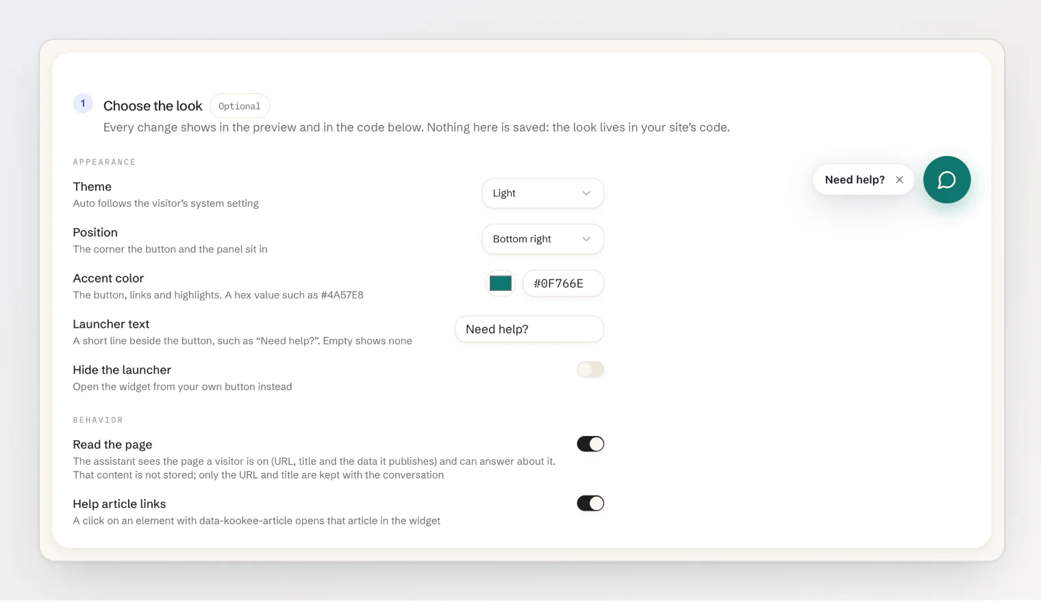
Nothing there is saved: the look lives in your site's code, so it is there from the first paint. See Install the site widget on your website.
One visual setting is the exception: an image for the top of Home, in place of the accent color, is uploaded on the Customize tab, because it has to be hosted somewhere. The logo beside it comes from Project settings. See Add Home and Help tabs to your widget.
The React widget and the React components
The React KookeeChatWidget renders in your page rather than in a shadow root, and reads the same --kookee-* variables as the React components for blogs, changelogs and help centers. If you theme those components by setting variables on :root, the chat widget picks the values up as well; its primaryColor still wins for the accent. Set the variables on the components' own roots instead, such as .kookee-blog-list, to keep the two apart; see Style and customize the React components.
Theme
light, dark, or auto to follow the visitor's system setting.
<script
  async
  src="https://kookee.dev/chat/latest.js"
  data-api-key="YOUR_API_KEY"
  data-theme="auto"
></script><KookeeChatWidget clientOptions={{ apiKey }} theme="auto" />auto is usually the right choice — it matches whatever the rest of the visitor's screen is doing.
Following your site's own theme toggle
auto follows the visitor's operating system, not your site. If your site has its own light/dark switch, tell the widget every time it changes:
window.KookeeChat.setTheme('dark'); // 'light', 'dark' or 'auto'The widget re-themes in place, with no reload: an open panel stays open, and an answer that is still streaming keeps streaming. Keep data-theme for the theme it starts with, and map a "system" choice in your toggle to 'auto'. If you call setTheme() before the script has loaded, add 'setTheme' to the queueing stub — see Control the chat widget from JavaScript.
In React, theme is an ordinary prop, so passing your app's current theme is all it takes:
<KookeeChatWidget clientOptions={{ apiKey }} theme={isDark ? 'dark' : 'light'} />Accent color
One color drives the widget's accents, including the launcher button:
<script
  async
  src="https://kookee.dev/chat/latest.js"
  data-api-key="YOUR_API_KEY"
  data-primary-color="#6366f1"
></script><KookeeChatWidget clientOptions={{ apiKey }} primaryColor="#6366f1" />Pick your brand color here. It is the single change that makes the widget read as part of your product rather than a bolt-on.
Position
bottom-right (the default) or bottom-left:
data-position="bottom-left"Move it to the side your other floating UI is not on. If something else already lives in the corner, init() also takes an offset of { x, y } to nudge the widget clear of it, and a zIndex to settle which one sits on top:
window.KookeeChat.init({
  apiKey: 'YOUR_API_KEY',
  position: 'bottom-left',
  offset: { x: 16, y: 80 },
  zIndex: 9999,
});
offset.x is measured from whichever side position picked — the right edge for bottom-right, the left edge for bottom-left — and offset.y from the bottom. Both default to 20px.
Each value takes a number, used as pixels, or any CSS length as a string. A string is the easier one when you want the widget to clear something whose height you do not know:
window.KookeeChat.init({
  apiKey: 'YOUR_API_KEY',
  offset: { x: '1rem', y: 'calc(var(--cookie-bar-height) + 1rem)' },
});
The same three options exist as React props:
<KookeeChatWidget
  clientOptions={{ apiKey }}
  position="bottom-left"
  offset={{ x: 16, y: 80 }}
  zIndex={9999}
/>
On narrow screens the panel sizes itself from offset.x, so a larger horizontal offset makes the mobile panel correspondingly narrower.
Wording
The text is yours to set:
<script
  async
  src="https://kookee.dev/chat/latest.js"
  data-api-key="YOUR_API_KEY"
  data-title="Help"
  data-greeting="Hi! Ask me anything about the product."
  data-placeholder="Ask a question..."
></script>data-title/title— the panel header.data-greeting/greeting— the message shown before the first question.data-placeholder/placeholder— the input placeholder.data-locale/locale— the widget's language.auto, the default, follows the page; see Show the widget in your visitors' language.
In React, suggestions adds quick-start pills; with init() it takes the same array of strings. Two or three of your most common questions works better than a long list.
The title, greeting, placeholder and suggestions can also be saved on the Customize tab of the Site widget page, where a teammate can change them without a deploy. Text set in your code wins over the saved text, so leave it out of the code if you want the dashboard to decide. See Add Home and Help tabs to your widget.
The launcher label
An optional pill of text next to the launcher button, which the visitor can dismiss:
data-launcher-label="Need help?"<KookeeChatWidget clientOptions={{ apiKey }} launcherLabel="Need help?" />It draws attention to a widget people otherwise scroll past. Since it is dismissible, it does not become permanent clutter for repeat visitors.
Hiding the launcher entirely
If you would rather open the widget from your own button, add data-hide-launcher="true" to the tag, or pass hideLauncher: true to init(). Then call KookeeChat.open() from the button — see Control the chat widget from JavaScript.
Controlling the panel from your own code
In React, open state follows the usual controlled and uncontrolled convention. Pass open together with onOpenChange to drive it yourself, or defaultOpen to set only the starting state:
const [open, setOpen] = useState(false);

<KookeeChatWidget
  clientOptions={{ apiKey }}
  hideLauncher
  open={open}
  onOpenChange={setOpen}
/>;
The panel's own close button reports through onOpenChange in both modes. Do not switch between controlled and uncontrolled after mount. With hideLauncher and neither open nor defaultOpen, the panel can never open — give it one or the other.
How the panel behaves
Some of the widget's behaviour is fixed rather than configurable, and worth knowing when you design around it:
The conversation is kept per browser tab and survives page navigation.
With more than one tab switched on, the widget opens on the first of them, and a bar along the bottom moves between them. A single tab shows with no bar.
A panel open at page load shows a short loading state until the settings saved in the dashboard arrive, unless the tabs are set in code.
The close button minimizes the panel and keeps the conversation; New chat in the header starts a fresh one.
Expanded mode uses the full height of the window.
The launcher label is dismissed per visitor, and the widget remembers that in their browser.