Your widget starts as a chat. More tabs turn it into the first place visitors look: Home, with your latest news and your links, Help, where they search and read your help center without leaving the page, and Feedback, where they send your team an idea or a bug report. You switch them on in the dashboard; your site's code does not change.
Switch the tabs on
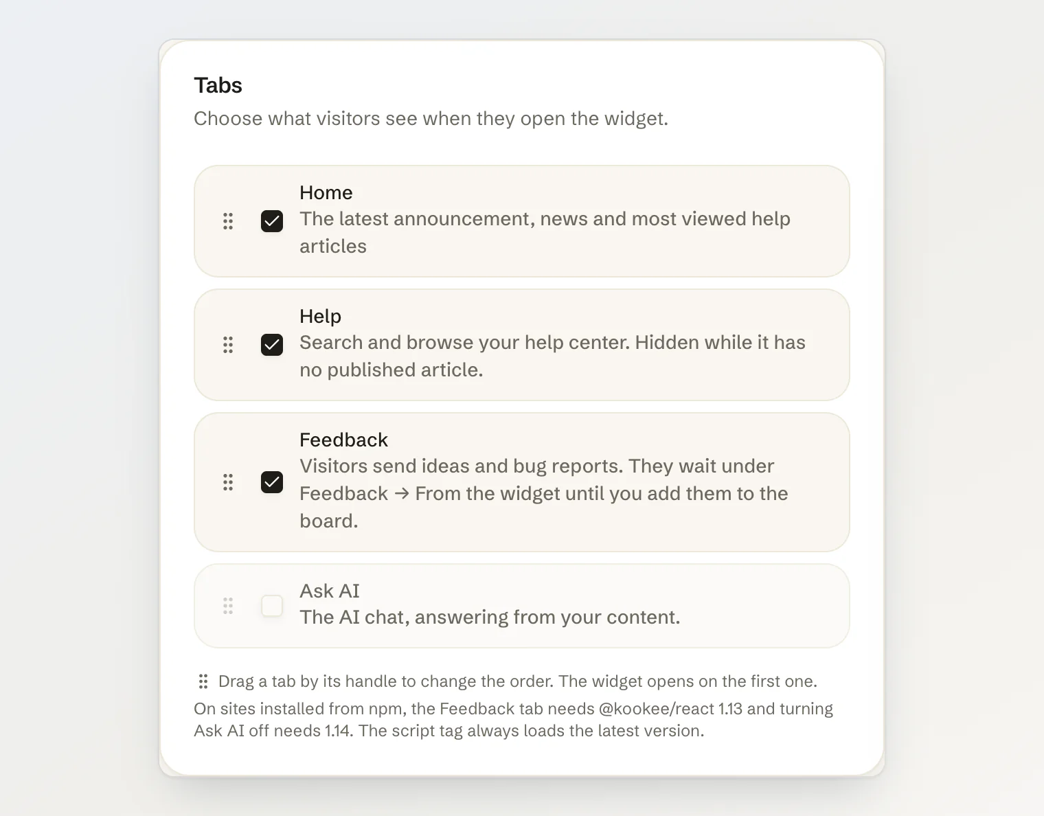
Open Site widget → Customize. The Tabs card lists the four tabs:
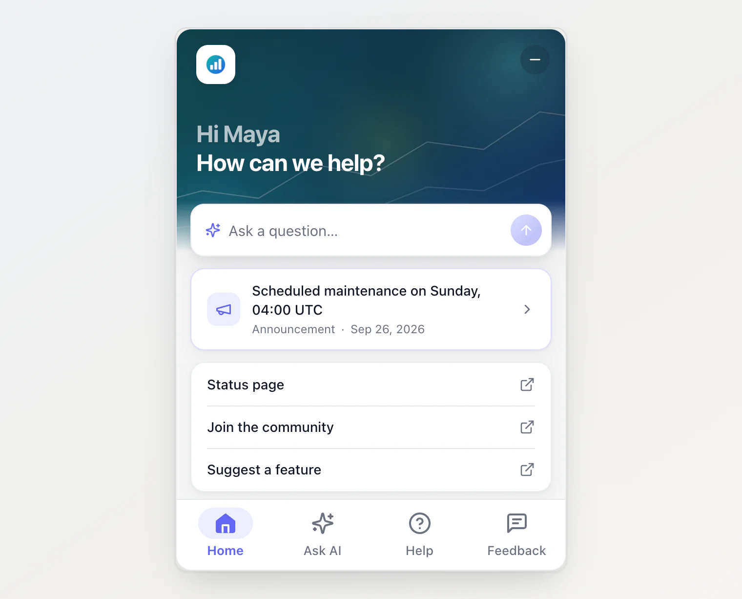
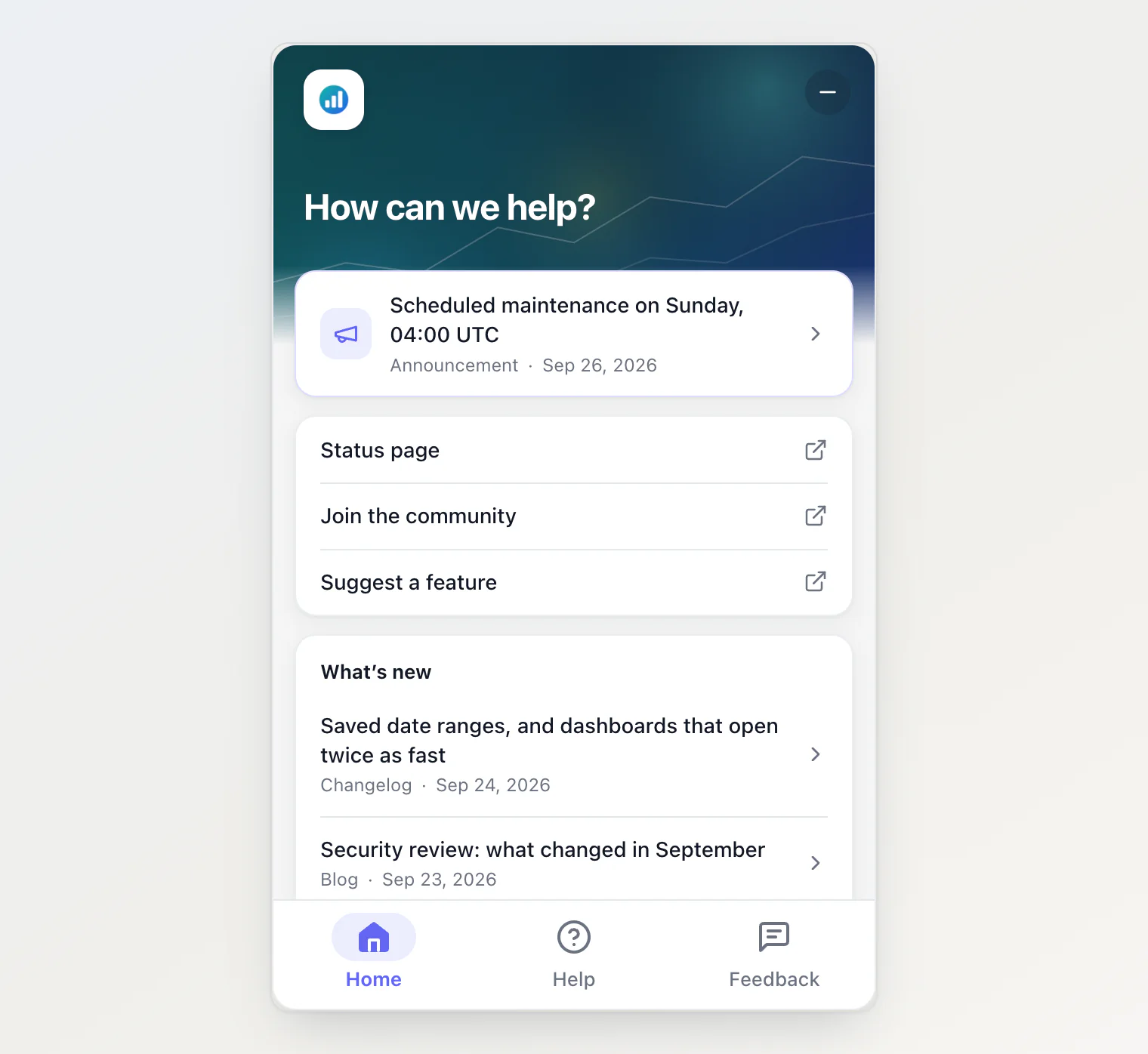
Home — a greeting, a question box, your latest announcement, your links, recent news and the most viewed help articles.
Ask AI — the AI chat, answering from your content. It can be turned off; see Without Ask AI below.
Help — search, and the collections of your help center.
Feedback — a short form for ideas and bug reports, which wait for your review. See Collect feedback from your site widget.
Tick the ones you want and drag them into order by the handle on the left. The first tab is where the widget opens. The last tab left on cannot be unticked: a widget always has at least one. The Live Preview beside the form shows the result as you go, before anything is saved.
Press Save. The bar that holds the button stays at the bottom of the screen and says when there are unsaved changes. A saved change reaches your site within about a minute, and nothing needs redeploying.
Reset to the plain chat takes the widget back to a chat with no tabs.
What Home shows
Home is built from content you already publish:
Your logo, and a header image if you uploaded one. Both are covered below.
The greeting. When your site tells the widget who is signed in, their first name goes above it — see Identify who is chatting.
A question box, when the Ask AI tab is on. A question typed here is sent, and the visitor lands in the chat with the answer on its way.
Active incidents and maintenance, from your status page, while one is under way. They are covered below.
The latest announcement, from your Announcements.
Your links, if you added any. They are covered below.
What's new: the five newest changelog entries, blog posts and other announcements, newest first.
Popular articles: the five most viewed help articles. With the Help tab on, a search box sits above them and opens the Help search.
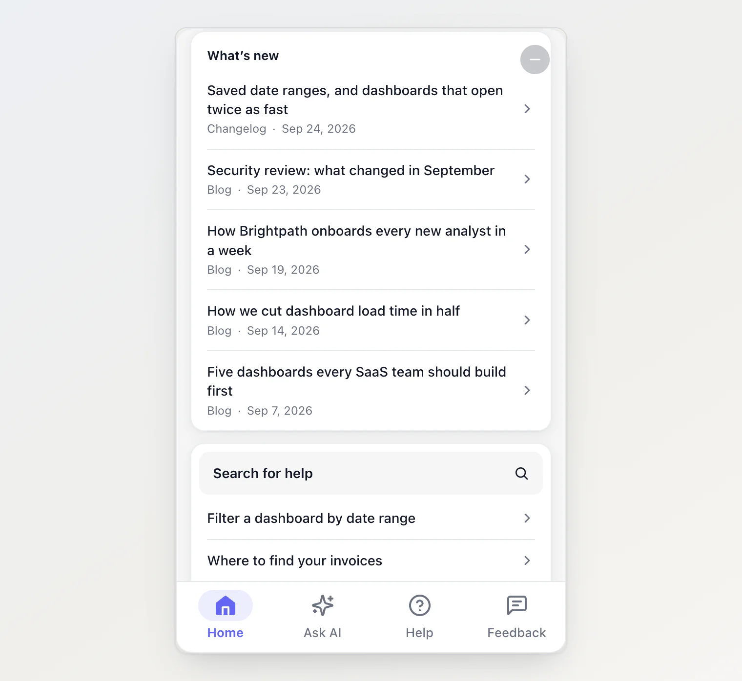
Anything a visitor taps opens inside the widget, with a back button. A changelog entry or a blog post has reaction buttons under it. A help article asks whether it helped and, with Ask AI on, offers Ask about this article, which carries its title into the chat.
A list with nothing to show is left out: a project with no announcements has no announcement card.
What Help shows
Help has a search box and your collections — the categories of your help center — each with its article count. A collection opens its articles, and an article opens in the reader. A help center without categories lists the articles themselves.
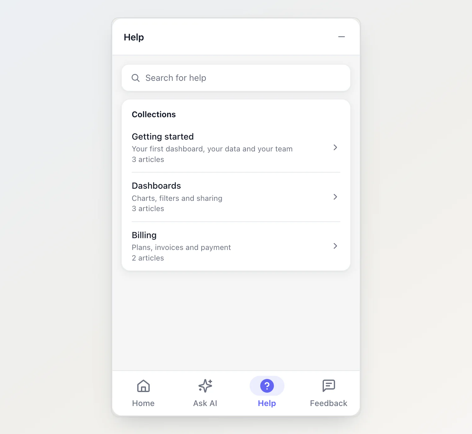
Help stays hidden while your help center has no published article, even when the tab is ticked, so visitors never land on an empty tab. The one exception is a widget whose only tab is Help: it stays, and says there are no articles yet.
Without Ask AI
Untick Ask AI for a widget with no chat at all: your news, your help center and a feedback form. Home loses its question box, an article loses Ask about this article, and nothing starts a conversation, not even your own code: KookeeChat.sendMessage() does nothing while the chat is hidden, so no answer is generated that nobody would see.
open('ask') and any other tab the widget does not show open its first tab instead. A widget with a single tab shows it without a tab bar. On the hosted portal, the Ask AI buttons of the help pages go away with the chat.
The script tag picks this up with no change. A site that installs the widget from npm needs @kookee/react 1.14 or later; older versions add the chat back.
Texts
The Texts card sets four things:
Title — shown at the top of the chat.
Greeting — the heading of Home, and the first line of an empty chat.
Placeholder — shown in the empty question box.
Suggestions — up to four questions a visitor can ask with one tap. Two or three of your most common ones work better than a long list.
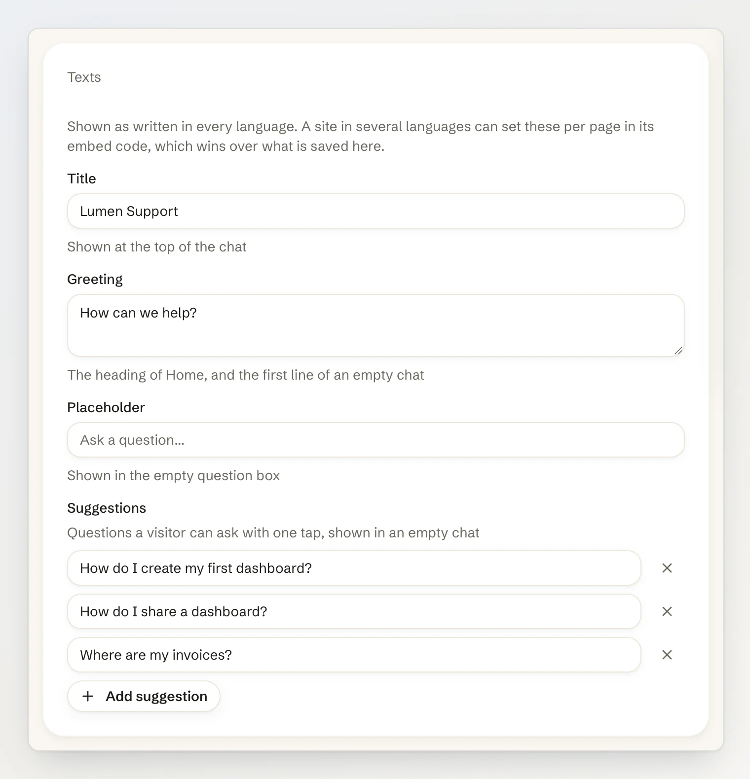
These are shown as written, in every language. If your site is in several languages, leave them empty, so the widget's own texts in each language apply, or set them in your code, where you can translate them. A value in code wins over the saved one. See Show the widget in your visitors' language.
Links
The Links card adds up to five links to Home: a status page, a community, your social accounts. Each one is a label and a web address that starts with https:// or http://, and it opens in a new tab.
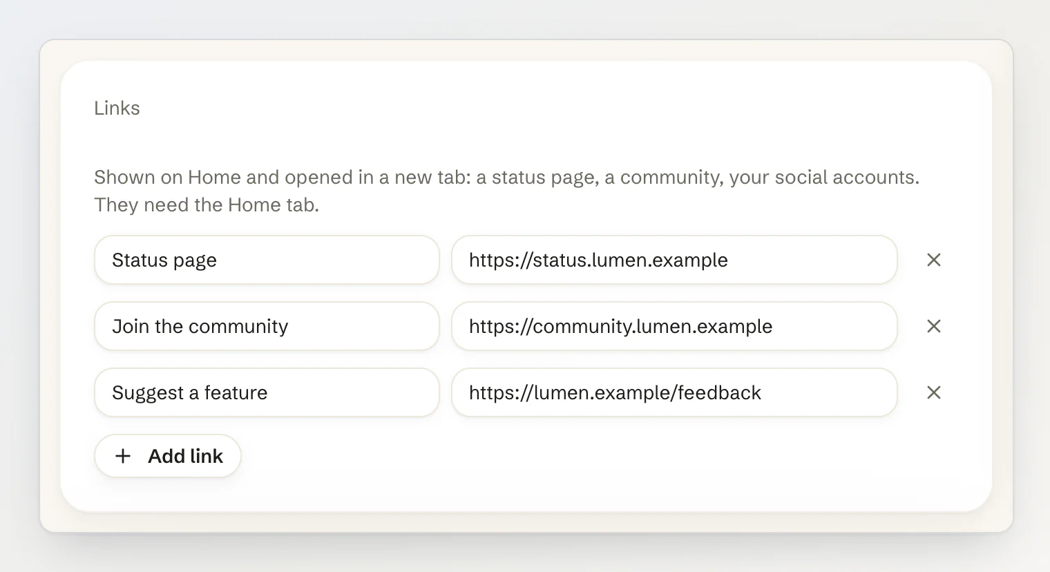
Links are part of Home, so they need the Home tab.
Status banner
While an incident or a maintenance on your status page is under way, Home shows it above the announcement, with its status. When your status page is public, it links to the incident's page in a new tab. The Status banner card holds the switch, Show active incidents on Home, which is on by default. Like links, the banner needs the Home tab, and a site that installs the widget from npm needs @kookee/react 1.18 or later. To set up the status page itself, see Set up a status page.
Header image and logo
The top of Home shows your accent color. The Header image card replaces it with an image: a photo of your product, your office, or a pattern in your brand colors. Upload it, check it in the Live Preview, and press Save.
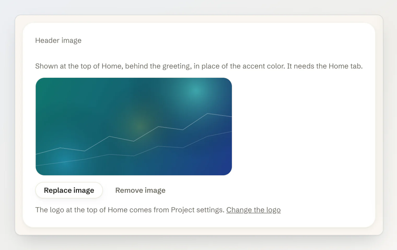
A dark shade over the image keeps the white greeting readable, and the bottom of the image fades into Home like the color did. The image is resized to at most 1200 pixels wide and saved as a JPEG, so even a large photo loads quickly on your site.
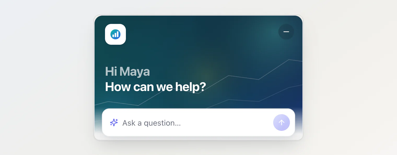
The logo in the top corner is your project's logo, on a white tile. It is set on the Project settings page, in the Project Logo card; without one, Home shows your project's name instead. The same logo appears on your project card in the dashboard and in the header of the public portal.
The logo is cut to a square on upload, so a square mark looks better than a wide wordmark.
Code still wins
Everything on this tab except the header image and the status banner can also be set in your site's code, and a value set there wins over the saved one, key by key. That is how a site in several languages passes translated texts, or how one page shows different tabs from the rest:
<script async src="https://kookee.dev/chat/latest.js"
  data-api-key="YOUR_API_KEY"
  data-tabs="home,ask,help"
data-greeting="How can we help?"></script><KookeeChatWidget
clientOptions={{ apiKey }}
tabs={['home', 'ask', 'help']}
greeting={t('How can we help?')}
links={[{ label: 'Status page', url: 'https://status.example.com' }]}
/>tabs={['ask']} forces the plain chat, whatever is saved. Tabs set in code are used exactly as given, so leave ask out for a page without the chat. The names of the tabs and the rest of the widget's own text follow the page's language, with English, Russian, Spanish, French, Portuguese and German built in; the labels option replaces any of them.
The look of the widget — theme, position, accent color and launcher — is set in code only. See Customize the chat widget's appearance.
What it costs
The widget asks for its settings once per page load. That request is not counted against your monthly API quota.
Every article a visitor opens in the widget is one API request. Browsing a collection and searching Help are requests too.
A question answered on the Ask AI tab, including one typed in Home's question box or sent with Ask about this article, counts as one AI answer when the reply links at least one of your articles: 50 a month on Free, 450 on Pro and 1,650 on Ultra, shared by all the owner's projects. Greetings, replies that found nothing and errors are free.
In React
Tabs need @kookee/react 1.11.0 or later, the header image 1.11.1, the Feedback tab 1.13.0, turning Ask AI off 1.14.0, and the status banner 1.18.0. The article reader needs two stylesheets next to the chat's own:
import '@kookee/react/chat.css';
import '@kookee/react/content.css';
import '@kookee/sdk/styles/content.css';
The script tag carries everything itself and picks the tabs and the header image up with no change.
On a phone
Any widget but the plain chat fills the screen on a phone. The plain chat stays the floating panel it always was.